Autumn is a beautiful time of year! It means winter is just around the corner and I LOVE winter! Don't get me wrong, spring and summer are great, but, in the northeastern part of North Carolina, where I live, summer means it's too hot and way too humid to really enjoy the outdoors. It's like a sauna outside in the summer!
Anyway... Autumn is a lovely time out here. It's finally slightly less hot and humid and my husband and I can finally enjoy the outdoors. While the North Carolina climate may not support aspen trees, I can at least pretend! Plus, the colorful foliage makes a nice contrast with the white bark of those trees.
From sketch to painting
I get inspired by everything I see, whether it be driving around out in the country side or just browsing pinterest... yeah, I know...LOL. My landscapes are usually scenes I'd like to imagine myself walking in. It's usually something that has been forgotten and so exciting to discover. Since I'm a farm girl at heart, I love barns, so I thought why not add one.
If you follow my instagram, I've posted pictures there too.


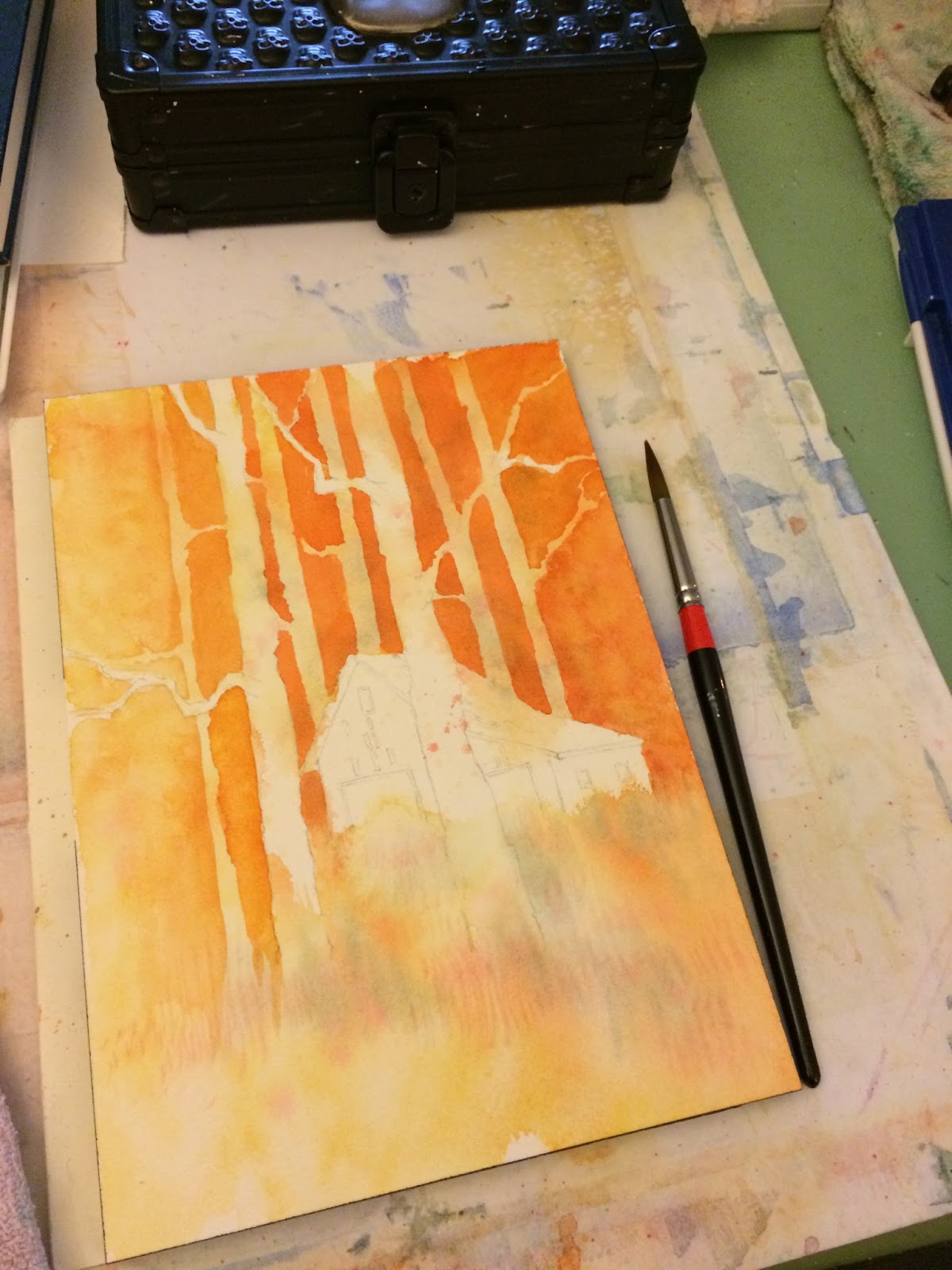
Step 3: After my initial wash was completely dry, I darkened the background with cad. orange and gamboge and let that dry.

Step 4: I continue adding color to my background, blocking out areas of trees.
Remember to let each layer completely dry before adding another.
I gradually painted darker shadows by adding French Ultramarine Blue to my mix of Cad. Orange and small hint of Quin. Red.
As my wash for the background got darker, I lifted away some of paint with a Kleenix while it was still wet. By lifting it away, you can see the layers underneath and it created a nice sense of foliage.

Step 5: Adding in details. Time to paint the barn! I wanted a very washed out, weathered and older looking barn, so I kept my colors lighter. I like to use my No. 6 for this type of work. The brown was a mix of French Ulta and Cad. Orange.
I also started painting in the details on the aspen trees in the foreground.
Step 6: The grass details were a more saturated Cadmium Orange and some Gamboge that got more detailed around my trees in the foreground. I used my smaller fan brush to create the grass.
My shadows were a combination of French Ultramarine Blue and Quinacridone Red. Those two colors I let blend more on the paper which created a nice value range of blue, red and purple.
Step 7: Adding in the blacks. I created a dark mix of all the colors used, which created a nice warm black.

Step 8: Continue with your details. I finished out my two aspens in the foreground. Added in some bushy branches at their base with the dark mix and added some faint details to some of the background trees..


Instagram - RLDavisFinArt
Twitter - Rebecca L. Davis
Pinterest - RLDavisArt
And for a selection of photography and watercolor prints, visit her website Rebecca Davis
Anyway... Autumn is a lovely time out here. It's finally slightly less hot and humid and my husband and I can finally enjoy the outdoors. While the North Carolina climate may not support aspen trees, I can at least pretend! Plus, the colorful foliage makes a nice contrast with the white bark of those trees.
From sketch to painting
I get inspired by everything I see, whether it be driving around out in the country side or just browsing pinterest... yeah, I know...LOL. My landscapes are usually scenes I'd like to imagine myself walking in. It's usually something that has been forgotten and so exciting to discover. Since I'm a farm girl at heart, I love barns, so I thought why not add one.
If you follow my instagram, I've posted pictures there too.
This is the final sketch:

I transferred this freehand and only in outline. I left the final details to be added as I painted.

I use Da Vinci watercolor paints. They are made in California and have some really vibrant colors. They are thick and creamy and wonderful to paint with.
Paper:
Arches 100% rag cotton watercolor paper 140lb. block 7"x10"
Tools:
2B pencil (for outline of sketch on the watercolor paper)
kneadable eraser (just in case - won't damage watercolor paper if used)
Paper:
Arches 100% rag cotton watercolor paper 140lb. block 7"x10"
Tools:
2B pencil (for outline of sketch on the watercolor paper)
kneadable eraser (just in case - won't damage watercolor paper if used)
Colors used:
- Gamboge
- French Ultramarine Blue
- Cadmium Orange
- Quinacridone Red
- Quinacridone Red
Brushes:
Silver Brush Black Velvet
No. 6 round
No. 10 round
Creative mark No.2 Fan Blender
Kleenix
Step 1: Wet your paper. Using the No. 10 round, I wet my paper with clean water. Keep areas of white dry, like the two trees in front and the barn.
Step 2: This is my initial wash of Gamboge, Cad Orange, a touch of French Ultra and a splatter of Quin. Red.
Important: Make sure to keep track of your light source, I kept the area light and bright. In this case, it was the left side of my paper.

Step 4: I continue adding color to my background, blocking out areas of trees.
Remember to let each layer completely dry before adding another.
I gradually painted darker shadows by adding French Ultramarine Blue to my mix of Cad. Orange and small hint of Quin. Red.
As my wash for the background got darker, I lifted away some of paint with a Kleenix while it was still wet. By lifting it away, you can see the layers underneath and it created a nice sense of foliage.

Step 5: Adding in details. Time to paint the barn! I wanted a very washed out, weathered and older looking barn, so I kept my colors lighter. I like to use my No. 6 for this type of work. The brown was a mix of French Ulta and Cad. Orange.
I also started painting in the details on the aspen trees in the foreground.
Step 6: The grass details were a more saturated Cadmium Orange and some Gamboge that got more detailed around my trees in the foreground. I used my smaller fan brush to create the grass.
My shadows were a combination of French Ultramarine Blue and Quinacridone Red. Those two colors I let blend more on the paper which created a nice value range of blue, red and purple.
Step 7: Adding in the blacks. I created a dark mix of all the colors used, which created a nice warm black.

Step 8: Continue with your details. I finished out my two aspens in the foreground. Added in some bushy branches at their base with the dark mix and added some faint details to some of the background trees..

The finished painting turned out really nice and warm. This is exactly what I want to find as I wander the forest of aspens in the cooler air of autumn.

Do you have a favorite time of year? Share your thoughts in the comments below!
Continue following Rebecca on her creative journey on these sites:
Facebook - R.L. Davis Fine Art & PhotographyInstagram - RLDavisFinArt
Twitter - Rebecca L. Davis
Pinterest - RLDavisArt
And for a selection of photography and watercolor prints, visit her website Rebecca Davis
Comments
Post a Comment