You've got your paints, your brushes and the drive to continue, sweet!
But wait... what kind of paper do you paint on?

As in my previous posts, here and here, about watercolor, it is a different and difficult medium, especially if you've never used it before.
If you want to try it, purchasing quality paints, brushes and paper will make all the difference!
I know it sounds expensive, but at least you'll have the best chance the medium has to offer to continue it's use. And besides, you can always gift/sell your supplies to another artist.
Starting out, you'll be tempted to buy in the bargain isles. Because, why would you spend money on something you may not like? I thought the same. As such, I had no idea the effect paper would have on my artwork. My first watercolor class found me grimacing in disappointment.
My bargain efforts were not rewarded...
Perseverance prevailed and I gradually learned. There's a huge difference between student grade and artist/professional grade materials. Learn from my mistakes, and your first experience with watercolor may be infinitely better.
Not all papers are created equal
Now, you may be thinking that you can use any paper for watercolor, but not so. If you just grab a sheet of paper from your printer to paint on, you'll be in for a big mess.
Watercolor paper is specifically designed to hold up against a lot of water. It will feel thicker, and sturdier than papers made for drawing. It is most commonly made from 100% rag cotton for its absorbency. While many papers were once handmade, today, many popular brands are made from a mould and the cotton fibers pressed and dried together using metal cylinders.
Handmade papers are fabulous. However, be aware that they may not all hold up to watercolor use and its' techniques. You can buy some handmade papers from art stores. If you do, cut off a small piece and do some testing to make sure it is usable. If you make your own, hey you're awesome!
The above goes for any paper not specifically made for watercolor. The general rule is, if you're unsure, test it.
Terminology:
Sizing - A protective coating of a glue-like substance in and on the paper. It helps the individual fibers resist paint and water. The less the sizing, the more absorbent the paper. Meaning, the less sizing, the more like painting on a sponge it's going to be like.
Weight - watercolor paper is listed in pounds(lbs.) and gsm (grams per square meter). There are three common weights for watercolor paper: 90lb.(190gsm), 140lb.(300gsm) 300lb.(638gsm). There are more, but you'll most likely encounter these.
Note: The higher the lbs or gsm, the thicker and stiffer the paper.
Note #1: I would avoid the 90lb. paper all together, no matter your artistic level. It is very light and flimsy and won't hold up to a lot of water. It may peel, clump, or start to pill (form little balls of paper) when using some techniques.
Note #2: All papers will buckle when using water, but quality watercolor paper, due to its weight and sizing, can withstand a lot.
Hot Press & Cold pressed papers - see below for more detail.
Tooth - the texture of the paper.
Stretching - A method using water to wet the paper to it's maximum and allowed to dry. If using this method, it is best to secure the paper to a hard surface (a piece of cardboard, wood or gator board) with either tape or a staple gun. As the paper dries, the tape or staples will help keep it from buckling.
Note: Be aware this method will affect the paper's sizing. It is also an optional process and some artists don't bother with it while others do.
Sheet - A standard sheet size is 22"x30". These can be cut to any size.
Blocks or pads - blocks usually have about 20 pieces of paper and are held together with a glue along the outer edges to help keep the paper from warping. There are pads, without the glued edging as well. You can get a number of difference sizes. They can get a bit more expensive than a sheet, depending on the brand.
Note: You can buy a sheet or two and just cut into preferred sizes.
Roll - A huge roll of watercolor paper, usually 55"x 11 yards! More expensive than single sheets or blocks. Be prepared to paint A LOT!!
Note #1: If you're going this route, make sure you really like the paper! Otherwise you'll be stuck with a lot of paper you won't want to use.
Note #2: Because the paper has been in roll form, you may need to cut the paper in advance and lay flat with weights, somewhere before painting (or you can use the stretch method).

Hot press papers.
Think of these papers as using a heated press or iron, to make an even and smooth surface. This surface has no tooth, which means less absorbency but the paint will stay on the surface longer. You can lift paint off more easily or move it around longer while it's still wet. These papers are good if you're doing a lot of detailed line work or using ink.
Cold Press papers.
These papers have a texture or 'tooth' applied to the surface. The paint pools in the grooves and allows for more absorption. It dries faster than hot press so you're limited to how long you can maneuver paint about. However, this paper allows for better water control.
I have about three different papers I paint on, Arches, Fabriano and Moulin du Roy for sheets and Saunder's Waterford and Arches for blocks and pads.
Note: There is also a rough textured paper.
There is a noticeable difference in painting with each. While paint may glide on smoother with the hot press, the cold press papers seem to carry the luminosity of the white paper better.
Brands.
Depending on where you live, you may or may not find one or more of these papers.
Most paper companies will carry a selection of student grade and artist grade, weights, textures, and colors.
Here are just a few:
Winsor & Newton - Not only does W&N have their own line of amazing watercolor paints, they also carry professional grade papers. Look for their professional line in pads or blocks.
Arches - A French company with a long history of making excellent watercolor papers on traditional cylinder moulds. Their papers are made from 100% cotton fibers. They can be a bit expensive, but they hold up super well. They have all kinds of choices here, choose one and start painting!
Fabriano - Another 100% cotton watercolor paper, is Italian. Less expensive than Arches and a very fine quality paper. Look for their Artistico series if you're purchasing a pad or block. I will usually buy a sheet or two and cut to the size I want.
Saunder's Waterford - An English watercolour 100% cotton paper made on a traditional cylinder mould. Very high quality paper. I've use pads of this I've found on amazon and found it really nice!
Strathmore - Be careful when using Strathmore. What you find at some craft/art stores are student grade and while durable and cheap, the tooth is larger and smoother. These are not cotton rag so they don't hold up well with watercolor techniques. Look for their 500 series paper, Gemini and Aquarius II, these ARE cotton and professional grade.
Canson - Like Strathmore, be careful when selecting papers. Their cheaper brands are NOT cotton. Look for their Heritage series or Montval or Moulin du Roy which are.
Recommendation for beginners:
Cold press 140lb.(300gsm) is probably going to be the best choice just starting out. The control of water is ideal for beginners. I would even go so far as to recommend a block or pad. This eliminates tape, stretching, and is easier to store if you've limited space.
As you grow in the medium, play with all of the papers! You'll find you may like one better than the other, and hey, that's OK. It's your art journey, learn and have fun!
Continue following Rebecca's artistic adventures on any of these sites:
Facebook - R.L. Davis Fine Art & Photography
Instagram - RLDavisFinArt
Twitter - Rebecca L. Davis
Pinterest - RLDavisArt
And for a selection of photography and watercolor prints, visit her website Rebecca Davis
But wait... what kind of paper do you paint on?

As in my previous posts, here and here, about watercolor, it is a different and difficult medium, especially if you've never used it before.
If you want to try it, purchasing quality paints, brushes and paper will make all the difference!
I know it sounds expensive, but at least you'll have the best chance the medium has to offer to continue it's use. And besides, you can always gift/sell your supplies to another artist.
Starting out, you'll be tempted to buy in the bargain isles. Because, why would you spend money on something you may not like? I thought the same. As such, I had no idea the effect paper would have on my artwork. My first watercolor class found me grimacing in disappointment.
My bargain efforts were not rewarded...
Perseverance prevailed and I gradually learned. There's a huge difference between student grade and artist/professional grade materials. Learn from my mistakes, and your first experience with watercolor may be infinitely better.
Not all papers are created equal
Now, you may be thinking that you can use any paper for watercolor, but not so. If you just grab a sheet of paper from your printer to paint on, you'll be in for a big mess.
 |
| Printer paper - the paint doesn't move about nicely and it warps really easily. |
Watercolor paper is specifically designed to hold up against a lot of water. It will feel thicker, and sturdier than papers made for drawing. It is most commonly made from 100% rag cotton for its absorbency. While many papers were once handmade, today, many popular brands are made from a mould and the cotton fibers pressed and dried together using metal cylinders.
Handmade papers are fabulous. However, be aware that they may not all hold up to watercolor use and its' techniques. You can buy some handmade papers from art stores. If you do, cut off a small piece and do some testing to make sure it is usable. If you make your own, hey you're awesome!
The above goes for any paper not specifically made for watercolor. The general rule is, if you're unsure, test it.
Terminology:
Sizing - A protective coating of a glue-like substance in and on the paper. It helps the individual fibers resist paint and water. The less the sizing, the more absorbent the paper. Meaning, the less sizing, the more like painting on a sponge it's going to be like.
Weight - watercolor paper is listed in pounds(lbs.) and gsm (grams per square meter). There are three common weights for watercolor paper: 90lb.(190gsm), 140lb.(300gsm) 300lb.(638gsm). There are more, but you'll most likely encounter these.
Note: The higher the lbs or gsm, the thicker and stiffer the paper.
Note #1: I would avoid the 90lb. paper all together, no matter your artistic level. It is very light and flimsy and won't hold up to a lot of water. It may peel, clump, or start to pill (form little balls of paper) when using some techniques.
Note #2: All papers will buckle when using water, but quality watercolor paper, due to its weight and sizing, can withstand a lot.
Hot Press & Cold pressed papers - see below for more detail.
Tooth - the texture of the paper.
Stretching - A method using water to wet the paper to it's maximum and allowed to dry. If using this method, it is best to secure the paper to a hard surface (a piece of cardboard, wood or gator board) with either tape or a staple gun. As the paper dries, the tape or staples will help keep it from buckling.
Note: Be aware this method will affect the paper's sizing. It is also an optional process and some artists don't bother with it while others do.
Sheet - A standard sheet size is 22"x30". These can be cut to any size.
Blocks or pads - blocks usually have about 20 pieces of paper and are held together with a glue along the outer edges to help keep the paper from warping. There are pads, without the glued edging as well. You can get a number of difference sizes. They can get a bit more expensive than a sheet, depending on the brand.
Note: You can buy a sheet or two and just cut into preferred sizes.
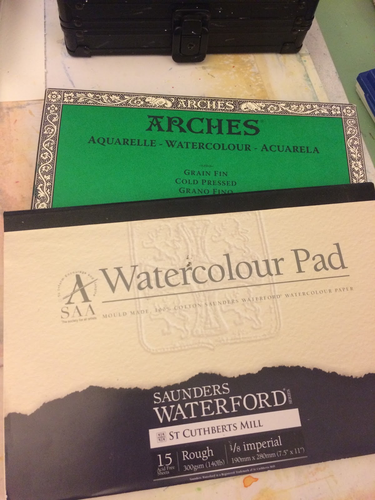 |
| Arches is a block and Waterford is a pad. |
Roll - A huge roll of watercolor paper, usually 55"x 11 yards! More expensive than single sheets or blocks. Be prepared to paint A LOT!!
Note #1: If you're going this route, make sure you really like the paper! Otherwise you'll be stuck with a lot of paper you won't want to use.
Note #2: Because the paper has been in roll form, you may need to cut the paper in advance and lay flat with weights, somewhere before painting (or you can use the stretch method).

Hot press papers.
Think of these papers as using a heated press or iron, to make an even and smooth surface. This surface has no tooth, which means less absorbency but the paint will stay on the surface longer. You can lift paint off more easily or move it around longer while it's still wet. These papers are good if you're doing a lot of detailed line work or using ink.
 |
| Top sheet is hot press, note how smooth the surface is compared to the papers below it. |
These papers have a texture or 'tooth' applied to the surface. The paint pools in the grooves and allows for more absorption. It dries faster than hot press so you're limited to how long you can maneuver paint about. However, this paper allows for better water control.
I have about three different papers I paint on, Arches, Fabriano and Moulin du Roy for sheets and Saunder's Waterford and Arches for blocks and pads.
Note: There is also a rough textured paper.
 |
| Cold press papers of varying textures. |
Brands.
Depending on where you live, you may or may not find one or more of these papers.
Most paper companies will carry a selection of student grade and artist grade, weights, textures, and colors.
Here are just a few:
Winsor & Newton - Not only does W&N have their own line of amazing watercolor paints, they also carry professional grade papers. Look for their professional line in pads or blocks.
Arches - A French company with a long history of making excellent watercolor papers on traditional cylinder moulds. Their papers are made from 100% cotton fibers. They can be a bit expensive, but they hold up super well. They have all kinds of choices here, choose one and start painting!
Fabriano - Another 100% cotton watercolor paper, is Italian. Less expensive than Arches and a very fine quality paper. Look for their Artistico series if you're purchasing a pad or block. I will usually buy a sheet or two and cut to the size I want.
Saunder's Waterford - An English watercolour 100% cotton paper made on a traditional cylinder mould. Very high quality paper. I've use pads of this I've found on amazon and found it really nice!
Strathmore - Be careful when using Strathmore. What you find at some craft/art stores are student grade and while durable and cheap, the tooth is larger and smoother. These are not cotton rag so they don't hold up well with watercolor techniques. Look for their 500 series paper, Gemini and Aquarius II, these ARE cotton and professional grade.
Canson - Like Strathmore, be careful when selecting papers. Their cheaper brands are NOT cotton. Look for their Heritage series or Montval or Moulin du Roy which are.
Recommendation for beginners:
Cold press 140lb.(300gsm) is probably going to be the best choice just starting out. The control of water is ideal for beginners. I would even go so far as to recommend a block or pad. This eliminates tape, stretching, and is easier to store if you've limited space.
 |
| Arches block pad, cold press 7"x10" and will run around $22. |
As you grow in the medium, play with all of the papers! You'll find you may like one better than the other, and hey, that's OK. It's your art journey, learn and have fun!
Continue following Rebecca's artistic adventures on any of these sites:
Facebook - R.L. Davis Fine Art & Photography
Instagram - RLDavisFinArt
Twitter - Rebecca L. Davis
Pinterest - RLDavisArt
And for a selection of photography and watercolor prints, visit her website Rebecca Davis
Comments
Post a Comment